
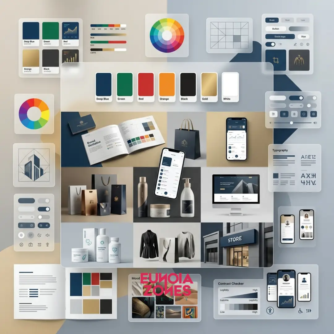
Colors are never just a cosmetic choice or a matter of personal preference; they are a powerful, silent communication tool that speaks directly to the consumer’s subconscious mind. Research indicates that consumers make an initial judgment about a product or brand within just 90 seconds of interaction, and up to 90% of that assessment is based on color alone.
The Emotional Impact of Colors in Marketing
Colors possess a unique ability to trigger specific emotions and drive consumer behavior without the user even realizing it. They function as psychological anchors linked to human memory and evolution. For instance, the right hue can instill a sense of safety and serenity before a visitor reads a single word of your website's copy, while another shade can spark urgency, pushing them toward a fast purchasing decision.
Your brand voice is a key part of a complete branding strategy. Discover how it fits into a successful identity in How to Build a Strong Brand Identity for Businesses in Egypt.
Common Color Associations and Their Branding Meanings
Every color carries a distinct psychological profile utilized by global brands to achieve specific strategic goals:
- Blue: Signals trust, stability, and professionalism. (Hence its dominance in finance and tech giants like IBM, Visa, and Meta).
- Red: Evokes passion, visceral energy, and increases the heart rate to create a sense of urgency. (Famously used by food chains like Coca-Cola and for clearance sale banners).
- Green: Represents nature, health, tranquility, and wealth. (The go-to choice for organic, eco-friendly, and sustainability brands).
- Black: Dictates luxury, elegance, sophistication, and authority. (Utilized heavily by high-end fashion houses like Chanel and Rolex.
A recognizable logo and a consistent voice work together to create a memorable brand. Read Logo Design Best Practices for Egyptian Businesses.
Choosing a Palette That Aligns with Brand Values
Never select colors simply because they look "pretty." Instead, choose them because they match the core personality of your business. If your brand value is rooted in youthfulness and digital innovation, vibrant shades like orange or magenta are highly effective. If your brand relies on legal sobriety and heritage, deep navy or slate grey are more appropriate. A professional palette should consist of a dominant base color, a supporting secondary color, and a high-contrast accent color.
Cultural Considerations in Color Psychology
Color is not a universal language; what symbolizes prosperity in one culture can represent mourning in another.
Global Warning: In Western and Middle Eastern cultures, white represents purity and peace. However, in several Asian cultures, it is closely tied to death and mourning. If your brand intends to scale internationally, auditing the cultural background of your target demographic is non-negotiable to avoid visual missteps.
The Role of Color in Logo Design and Website Aesthetics
Applying your palette requires strict visual balance to ensure a high-quality user experience:
- In Logos: The color must convey the brand's core message instantly, maintaining its impact even when stripped of gradients or complex textures.
- In Website Aesthetics: Designers recommend the 60-30-10 Rule. 60% of the space is dominated by a neutral background color, 30% is dedicated to your secondary brand color, and a sharp 10% is reserved for your accent color. This 10% should be used exclusively for Call-to-Action (CTA) buttons like "Buy Now" or "Sign Up", guiding the user's eye seamlessly.
Small businesses can build a memorable brand without exceeding their budget. Read Affordable Branding Strategies for Small Businesses in Egypt.
Testing Color Schemes for Optimal Brand Perception
Before finalizing your corporate brand guidelines, your color scheme must undergo practical stress-testing (A/B testing). Present your designs using different color variations to a sample of your target demographic to measure their emotional response. Furthermore, test the colors across various screen panels (OLED, LCD) and physical print mediums to guarantee that your shades remain consistent and powerful in any environment.
The Strategic Takeaway:
Colors are the initial handshake between your business and a customer. When you design your visual identity using strategic psychology rather than guesswork, you give your brand a visual voice that cuts through market noise and connects directly with your audience's emotions.
Your brand's personality should be reflected in both its visual identity and communication style. Discover Creating a Brand Voice That Builds Customer Loyalty in Egypt.